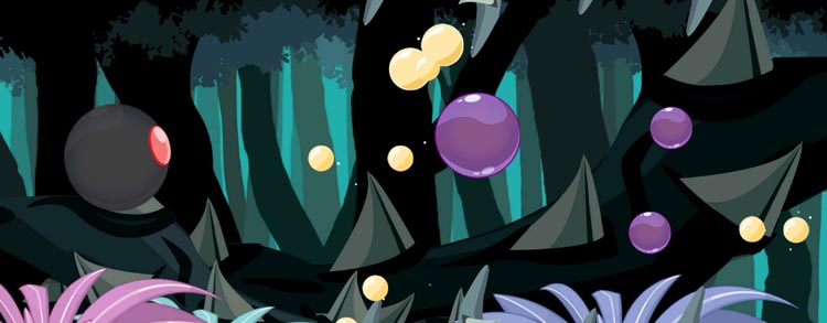
Pixi Pop version 1.2 is out! This new update brings interface changes to make the game more fun and easier to use. Check out this article to find out what's new.
Just a few days ago, Pixi Pop version 1.2 was rolled out by the Google Play store. This release contains mostly interface changes to make the game easier to understand for new players. But existing players will benefit from it too.
The first change is noticeable directly when you boot the game. There is a new loading screen in place which gives more feedback on the loading progress. It makes it more obvious the game is still loading and you're not stuck on the loading screen.
When you get past the loading and enter the menu screen, you get to see the new navigational buttons. The app navigation now uses clear buttons with text instead of just icons, to make it easier for new players to find their way around. Aside from that, all screens and in-game texts now use a new font. It's a bit smaller and easier on the eyes.
The tutorial stage also received noticeable changes. It had a total makeover to explain the gameplay elements in a more visual manner. As a player, you're no longer just guided by rows of text, but small animations show you what to do. The gameplay had some small adjustments too. The small pixies have been replaced by larger ones, to make the tutorial stage a real breeze.
Here's what the update brings in short:
- Updated UI - A new user interface for all game screens.
- New default font - The new font is less explicit and easier to read.
- More visual tutorial - Better guidance to help you through the tutorial stage.
- New loading screen - Lines are displayed during the loading of the game.
You can check out this new version right now in Google Play Store!


Leave a comment